Truth Hurts : Brew Co
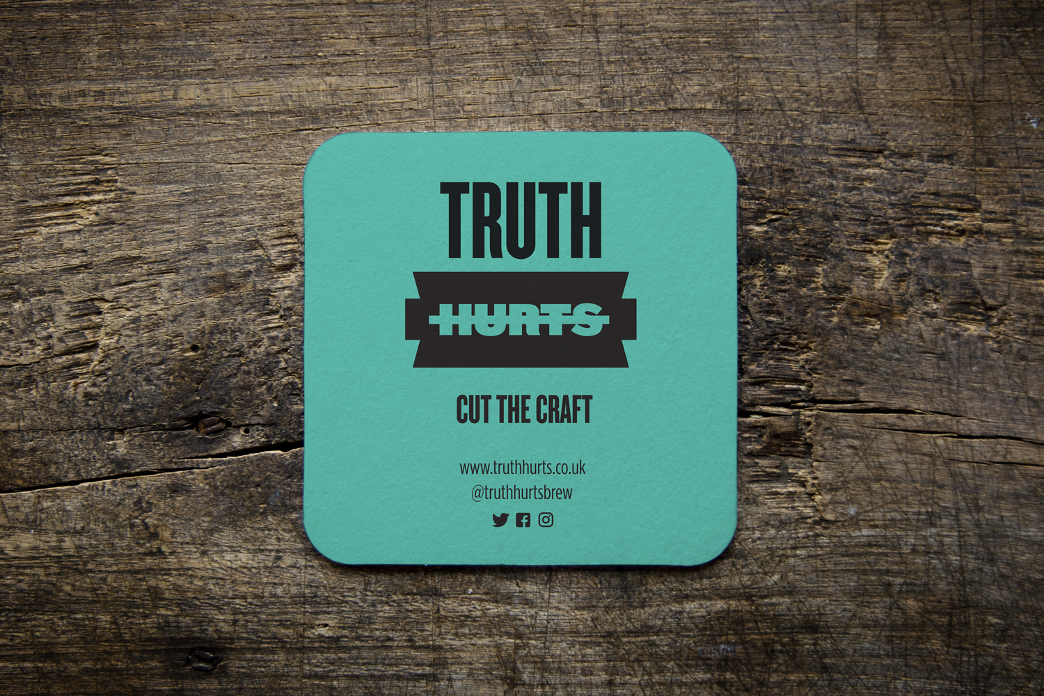
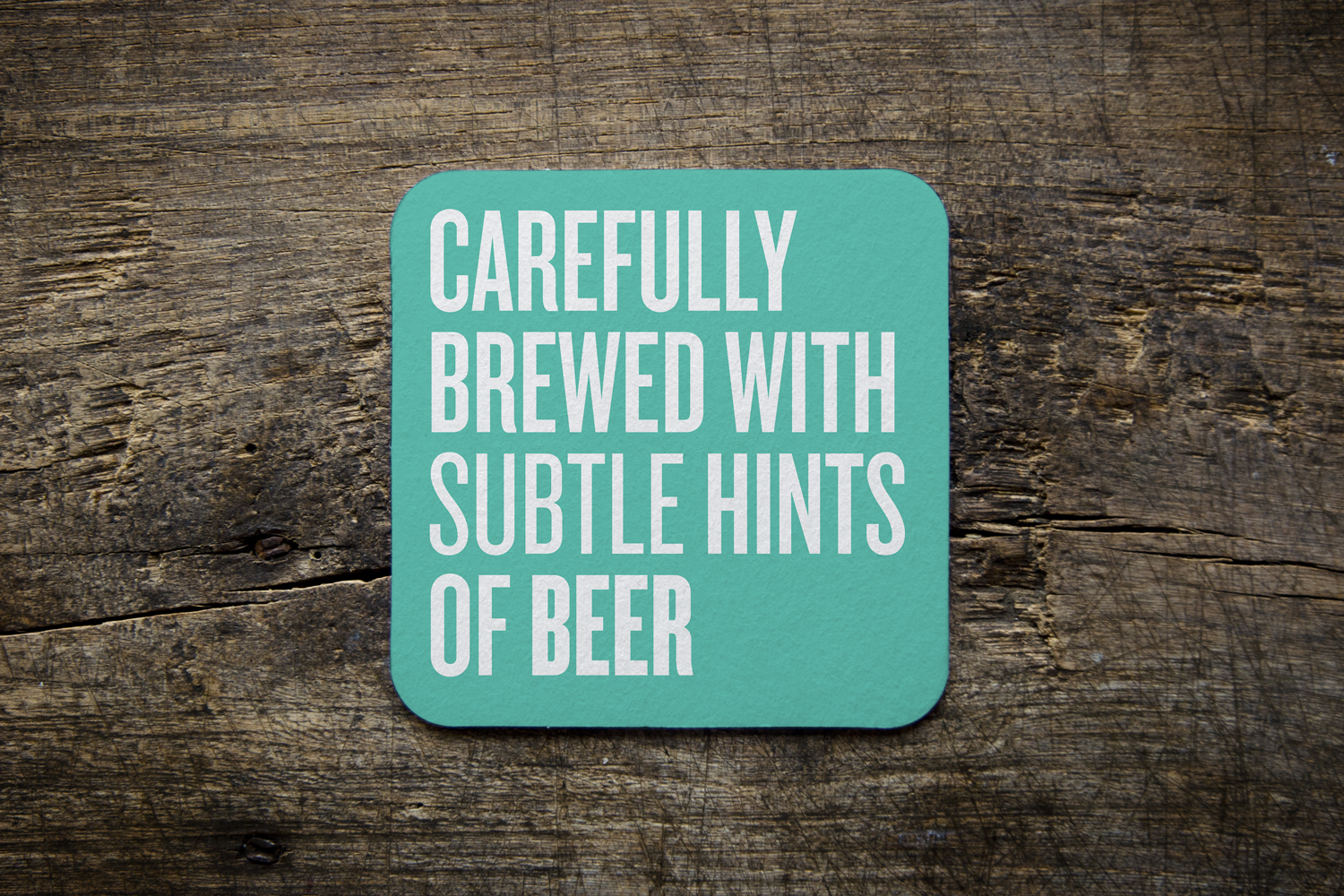
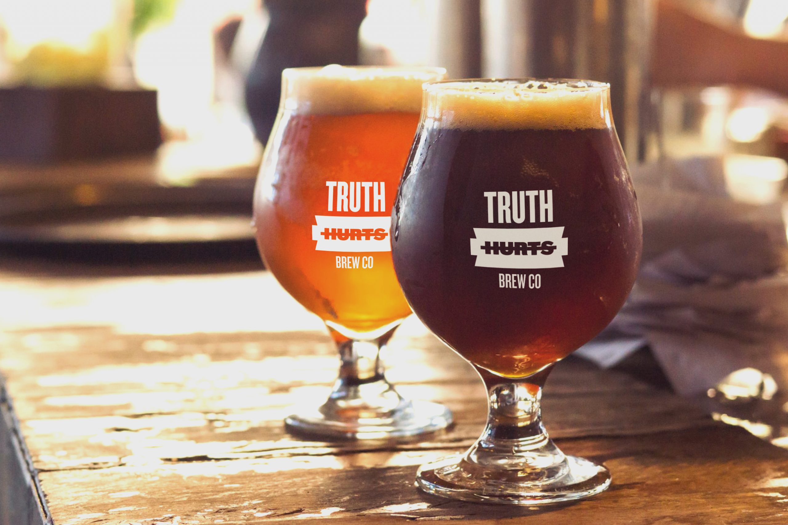
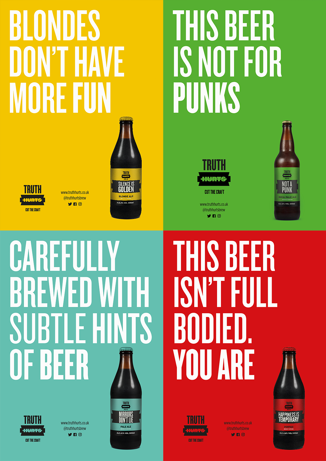
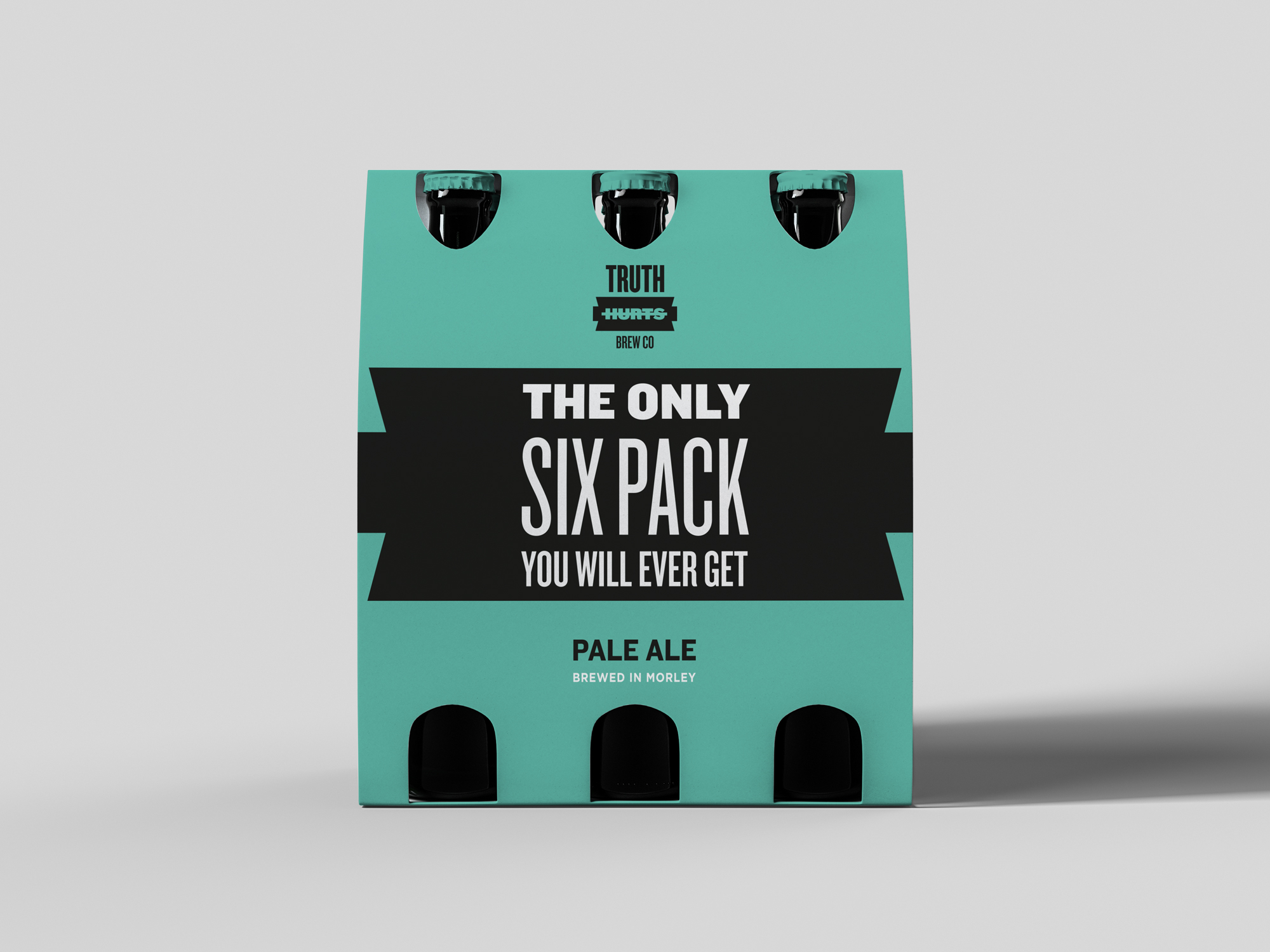
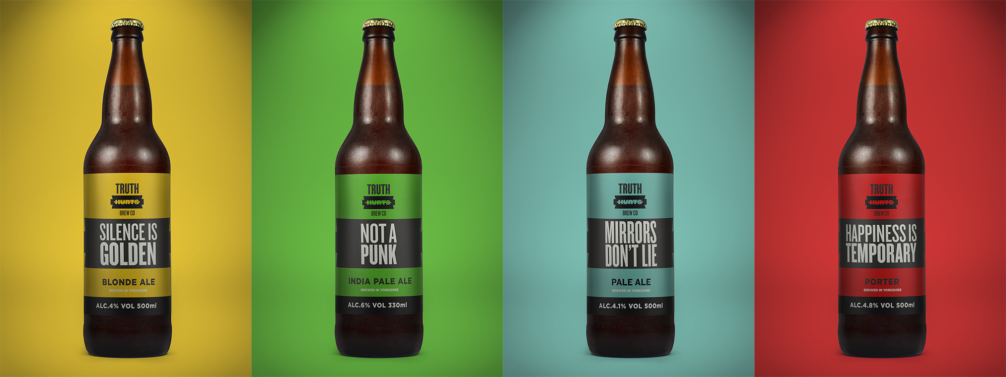
The brewery wanted to rebrand and release a series of new craft beers. The ethos of the company is straight-talking and anti-craft beer nonsense. We created the Brand Identity to play with the anti-craft beer humour and promoting the brewery in ways that would work locally and launch them onto the national scene. The logo is a razor that refers to hurt and cutting through the craft.
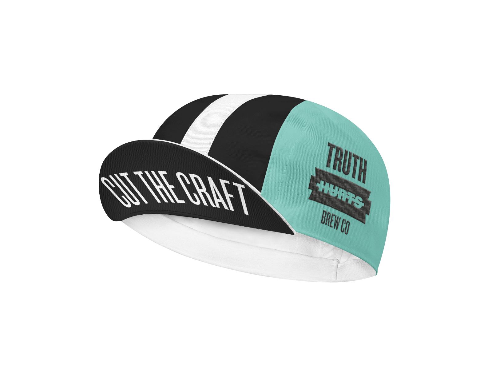
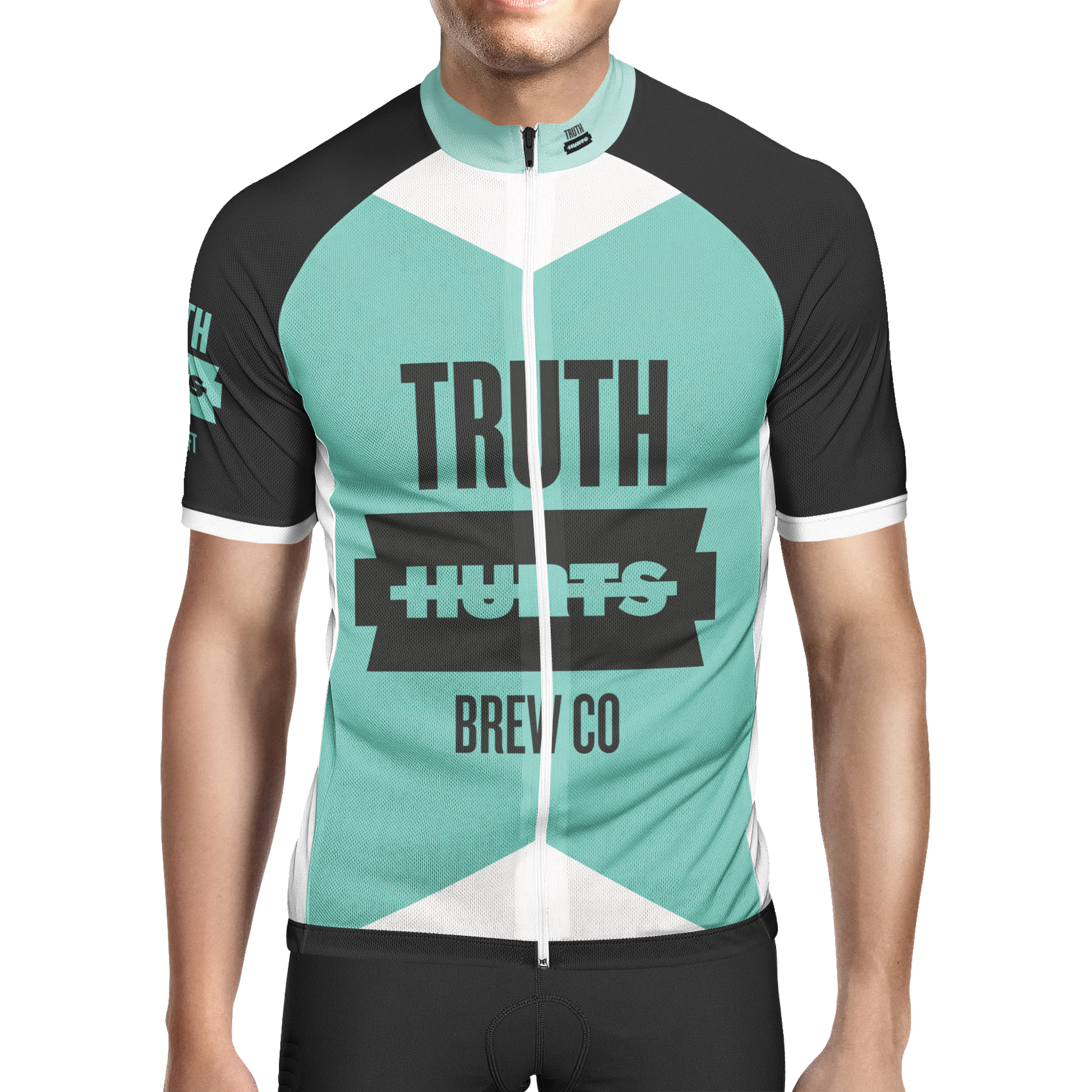
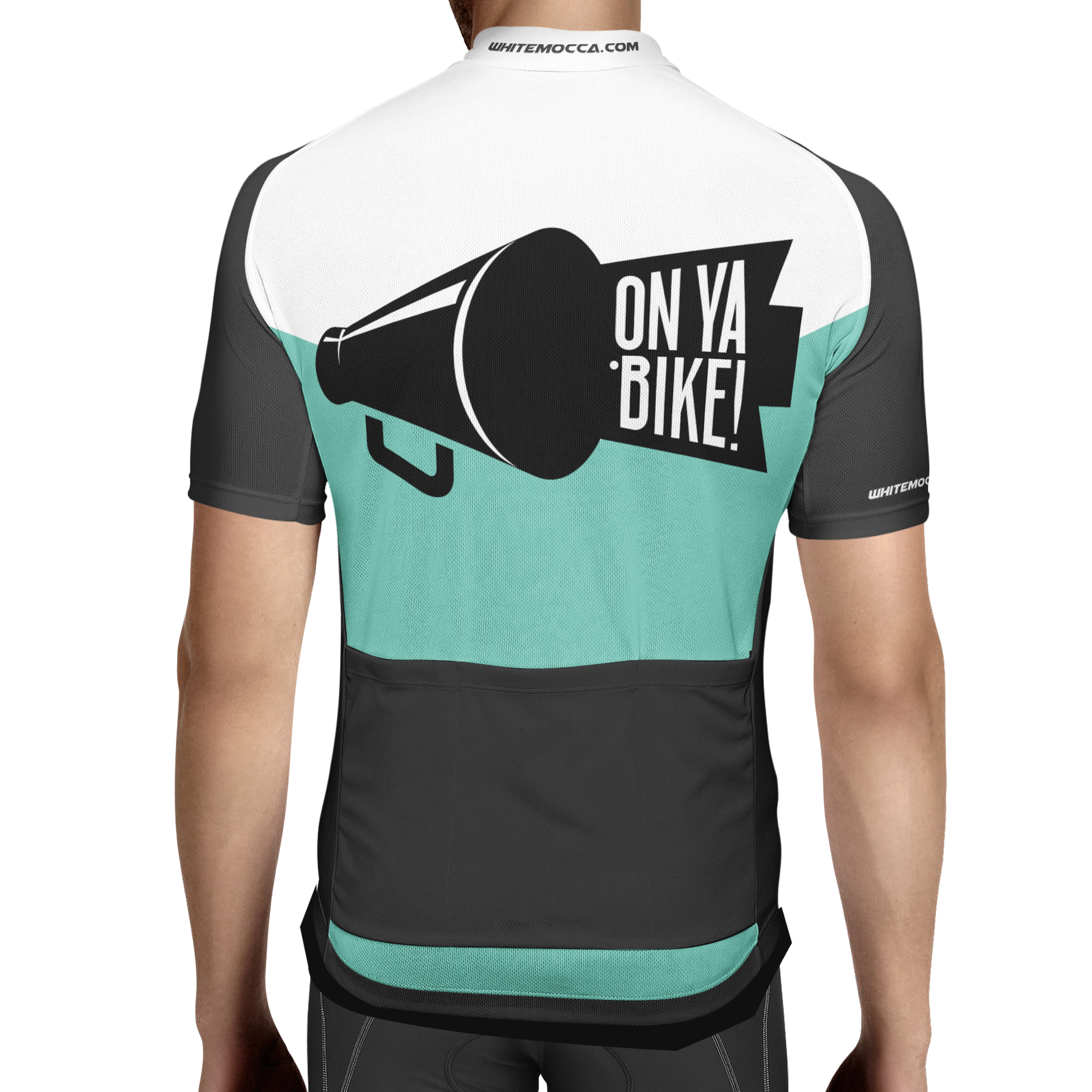
The brewery asked us to think of unique ways to raise awareness of the brand with Merchandise... we started with a t-shirt but seeing as every beer brand has a t-shirt design, we thought we would dig a little deeper. We created the concept of having a Truth Hurts cycling team, a growing trend in NYC with Brewing Companies, and as Leeds has such a huge cycling scene this seemed like a perfect match. Matching the brands’ tone of voice, we went for the On Ya Bike slogan with the bottle/mouthpiece/razor.
Category:
